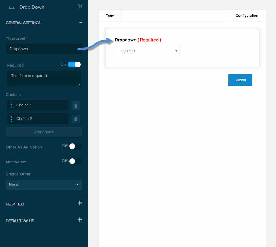
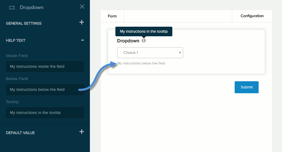
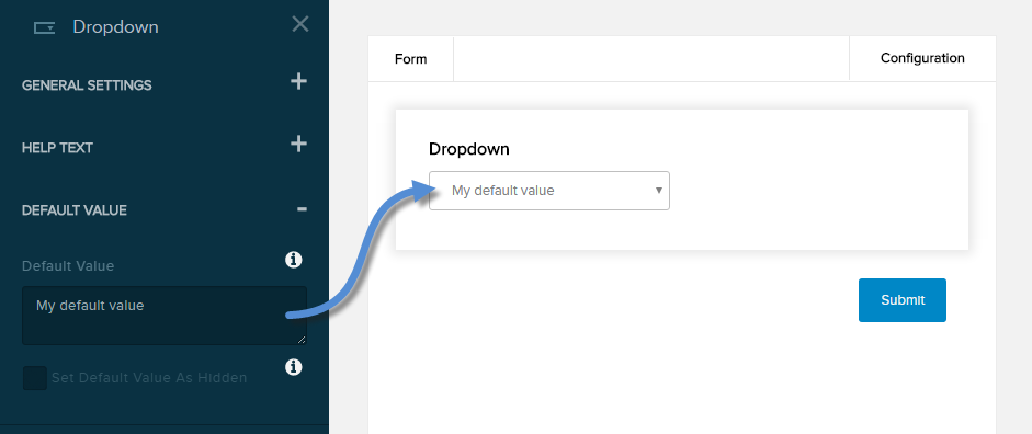
| Title/Label |
Name of the field. You can change the name either in the General Settings panel or directly above the field on the canvas. |
| Required |
If enabled (On),
- The field name is marked as required.
- The message you enter in the provided text box will be displayed if the user does not provide a value in the field.
|
| Choices |
The list of options.
- To add an option, click/tap Add Choice and enter the option label in the text field.
- To edit an option, click/tap an existing option and edit its label.
- To delete an option, click/tap the trash icon next to it.
- To rearrange the order of the options, drag and drop each option to a new position in the list.
|
| Other As An Option |
If enabled (On), the user can enter a custom option in the text box and choose that option. |
| Multiselect |
If enabled (On), the user can choose one or more options. |
| Choice Order |
- None
- Alphabetically
- Randomized
|