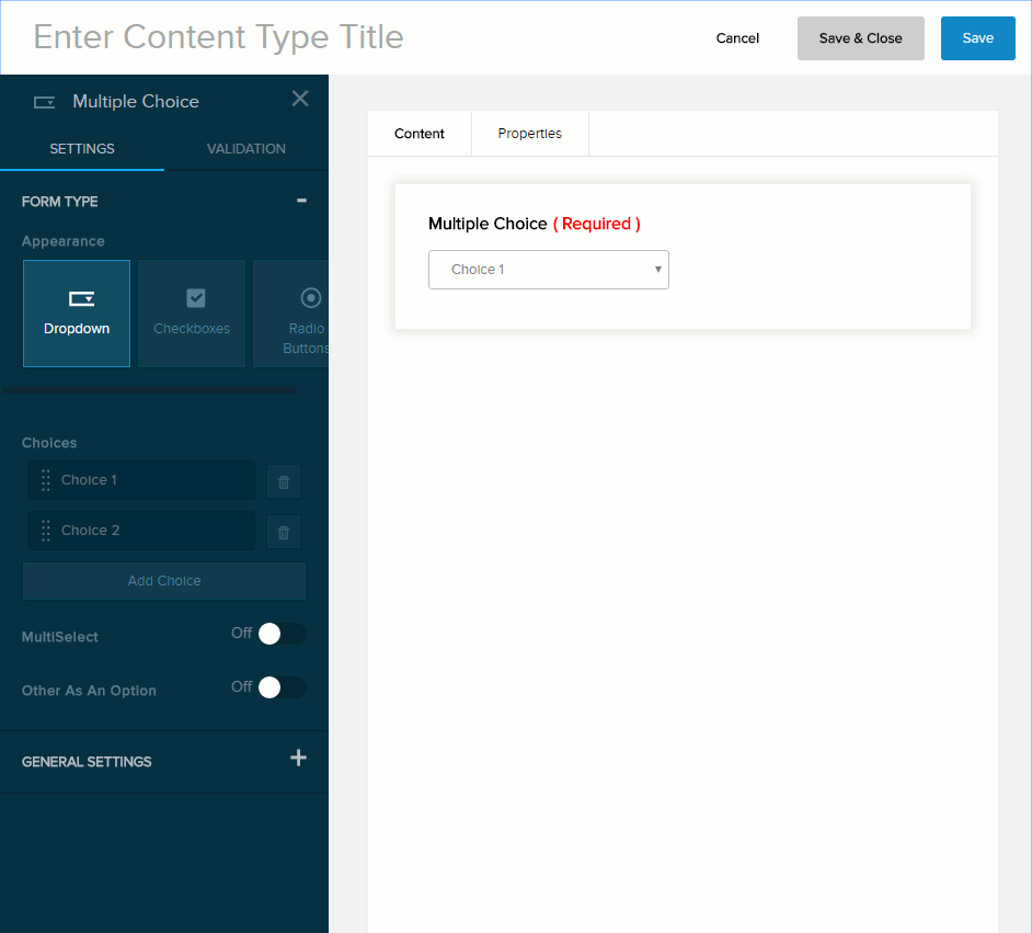
Content Field: Multiple Choice

  • Evoq Engage

Form Type


Form Type for Multiple Choice field

Field Description
Appearance
  • Dropdown. Displays the options in a dropdown. Can allow a single selection or multiple selections, depending on the MultiSelect setting.
  • Checkboxes. Allows multiple selections.
  • Radio Buttons. Allows only one selection.
Choices The list of options.
  • To add an option, click/tap Add Choice and enter the option label in the text field.
  • To edit an option, click/tap an existing option and edit its label.
  • To delete an option, click/tap the trash icon next to it.
  • To rearrange the order of the options, drag and drop each option to a new position in the list.
Multiselect If enabled (On), the user can choose one or more options.
List Orientation
  • Horizontal. Displays the options left-to-right and wraps to the next line.
  • Vertical. Displays the options, one per line.
Other As An Option If enabled (On), the user can enter a custom option in the text box and choose that option.

General Settings


General Settings for Multiple Choice field

Field Description
Title/Label Name of the field. You can change the name either in the General Settings panel or directly above the field on the canvas.
Default Value The value to assign to the field if the user does not provide a custom value. If blank, the Help Text Inside Field value is displayed.
Description If enabled (On), displays the instructions or field description you enter in the provided text box. Maximum length: 140 characters.
Tooltip If enabled (On) and the user hovers/clicks/taps over the information icon (i) next to the field name, displays the help text you enter in the provided text box. Maximum length: 140 characters.

Validation


Validation for Multiple Choice field

Field Description
Error Message The message to display if the user entered data that does not meet the requirements for the field.
Required If enabled (On),
  • The field name is marked as required.
  • The message you enter in the provided text box will be displayed if the user does not provide a value in the field.
Choice Order
  • None
  • Alphabetically
  • Randomized