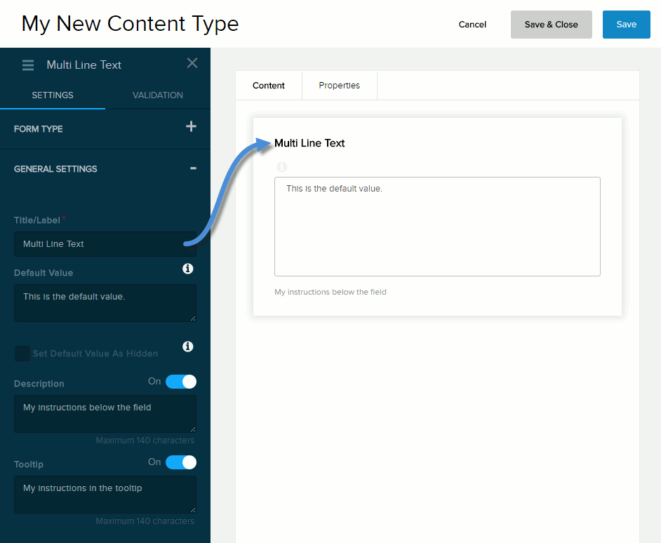
Content Field: Multi-Line Text

  • Evoq Engage

Form Type


Form Type for Multi-Line Text field

Field Description
Appearance
  • Multi-Line. Plain text. You can restrict the length of the text under Validation. Line breaks are replaced by <br/>.
  • Text Editor. Formatted text. You can restrict the length of the text under Validation. The generated HTML code is used as is.

General Settings


General Settings for Multi-Line Text field

Field Description
Title/Label Name of the field. You can change the name either in the General Settings panel or directly above the field on the canvas.
Default Value The value to assign to the field if the user does not provide a custom value. If blank, the Help Text Inside Field value is displayed.
Set Default Value as Hidden If checked,
  • The default value is not displayed to the user.
  • Required must be Off.
Description If enabled (On), displays the instructions or field description you enter in the provided text box. Maximum length: 140 characters.
Tooltip If enabled (On) and the user hovers/clicks/taps over the information icon (i) next to the field name, displays the help text you enter in the provided text box. Maximum length: 140 characters.

Validation


Validation for Multi-Line Text field

Field Description
Error Message The message to display if the user entered data that does not meet the requirements for the field.
Required If enabled (On),
  • The field name is marked as required.
  • The message you enter in the provided text box will be displayed if the user does not provide a value in the field.
Number of Characters If enabled (On), the message you enter in the provided text box will be displayed if the user provides a value outside the valid range. You must indicate the valid range:
  • Minimum. The valid range is from the value you enter in Min to infinity.
  • Maximum. The valid range is from infinity to the value you enter in Max.
  • Between. The valid range is from the value you enter in Min to the value you enter in Max.
Min must be less than Max.