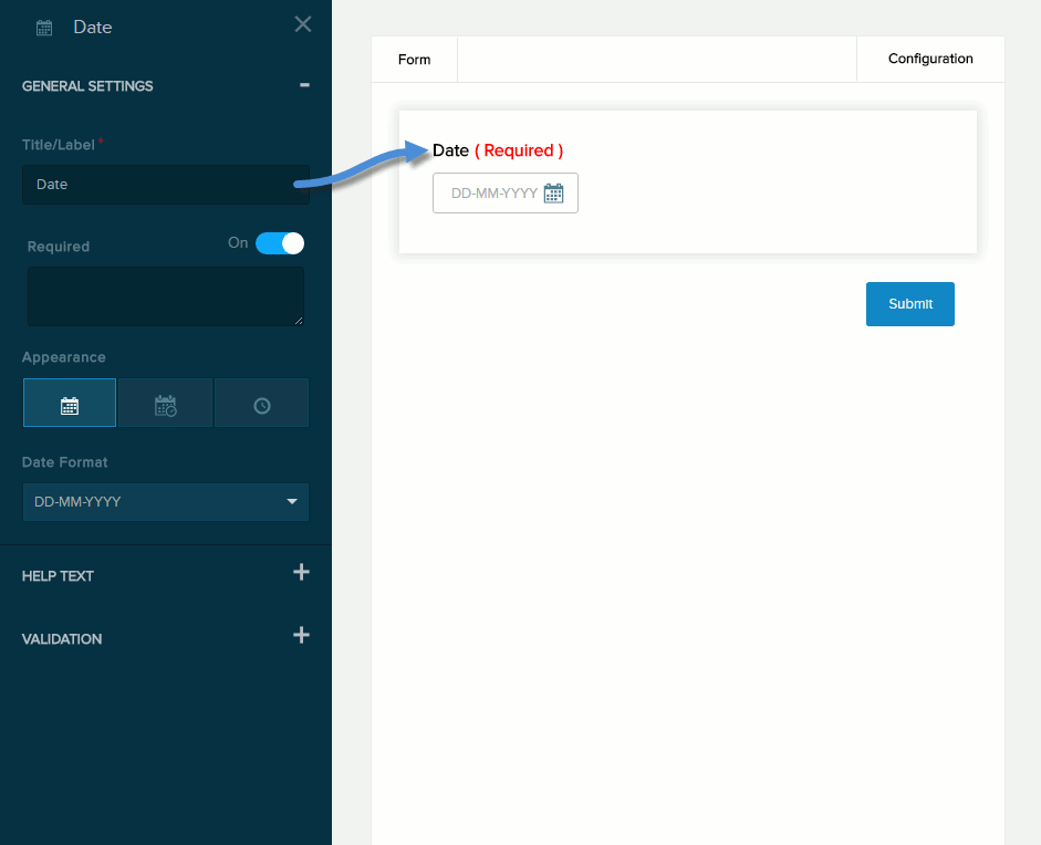
Form Field: Date / Time

  • Evoq Engage

General Settings


General Settings for Date / Time field

Field Description
Title/Label Name of the field. You can change the name either in the General Settings panel or directly above the field on the canvas.
Required If enabled (On),
  • The field name is marked as required.
  • The message you enter in the provided text box will be displayed if the user does not provide a value in the field.
Appearance
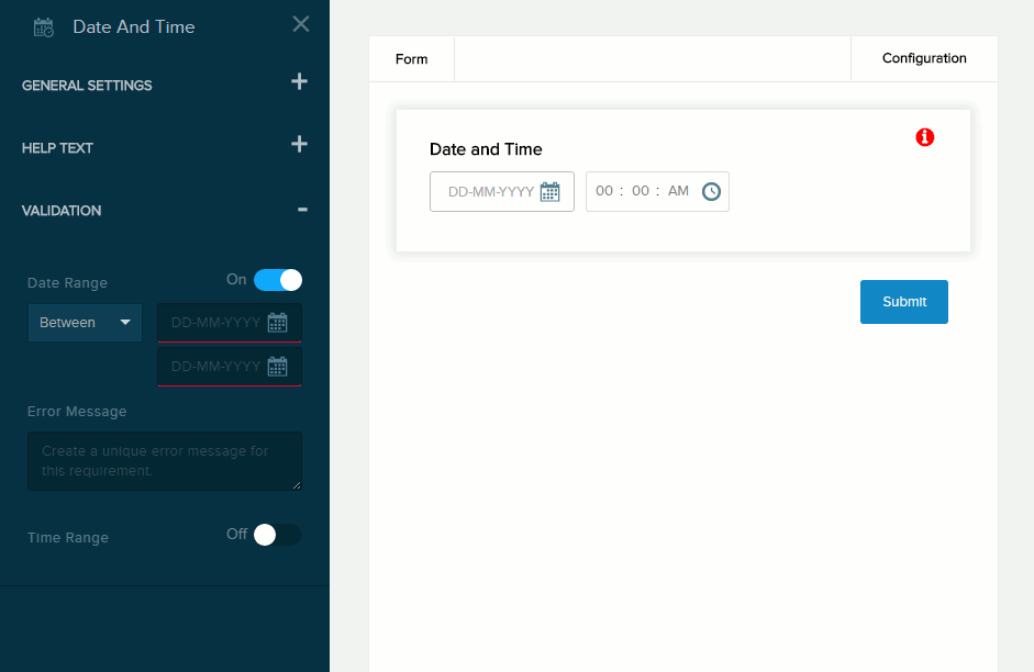
  • Date. The user can choose only the date.
  • Date / Time. The user can choose both the date and the time.
  • Time. The user can choose only the time.
Date Format How the date is displayed.
Time Format How the time is displayed.
Include Timezone If enabled (On), the time is stored with the specified timezone.

Help Text


Help settings for Date and Time field

Field Description
Below Field Help text to be displayed below the field. Maximum length: 140 characters.
Tooltip If enabled (On) and the user hovers/clicks/taps over the information icon (i) next to the field name, displays the help text you enter in the provided text box. Maximum length: 140 characters.

Validation


Date validation settings for Date and Time field


Time validation settings for Date and Time field

Field Description
Error Message The message to display if the user entered data that does not meet the requirements for the field.

Time Range

Date Range

If enabled (On), the message you enter in the provided text box will be displayed if the user selects a date/time outside the valid range. You must indicate the valid range:
  • Before. The valid range is from infinity to the date/time you select.
  • After. The valid range is from the date/time you select to infinity.
  • Between. The valid range is from the date/time you select in the first field to the date/time you select in the second field. The first date/time value must be earlier than the second date/time value.